We Hope You Like Green

Monochrome by Oatly Pop Up
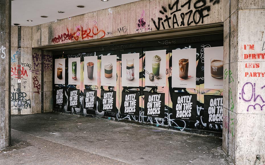
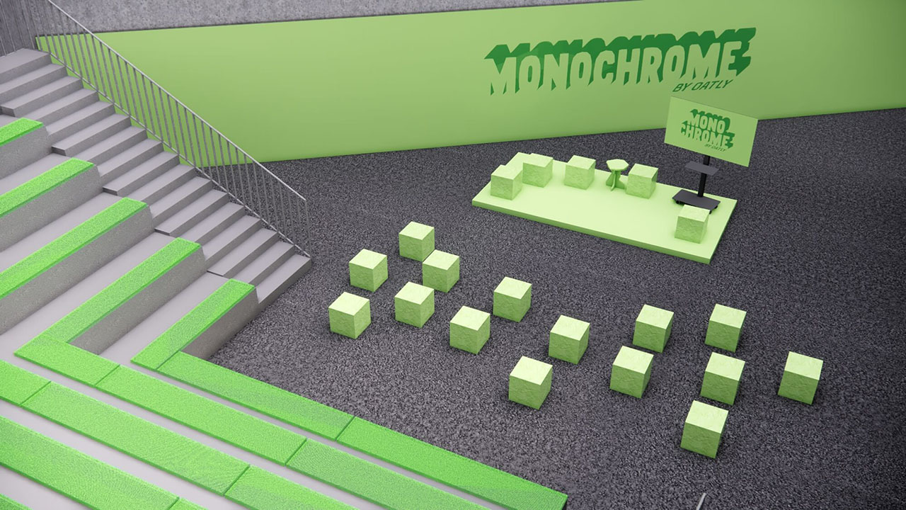
How do you make matcha tangible in real life — and create maximum shareable moments along the way? For Monochrome by Oatly on Ku'damm, we developed a pop-up concept that makes brand and product instantly recognizable.
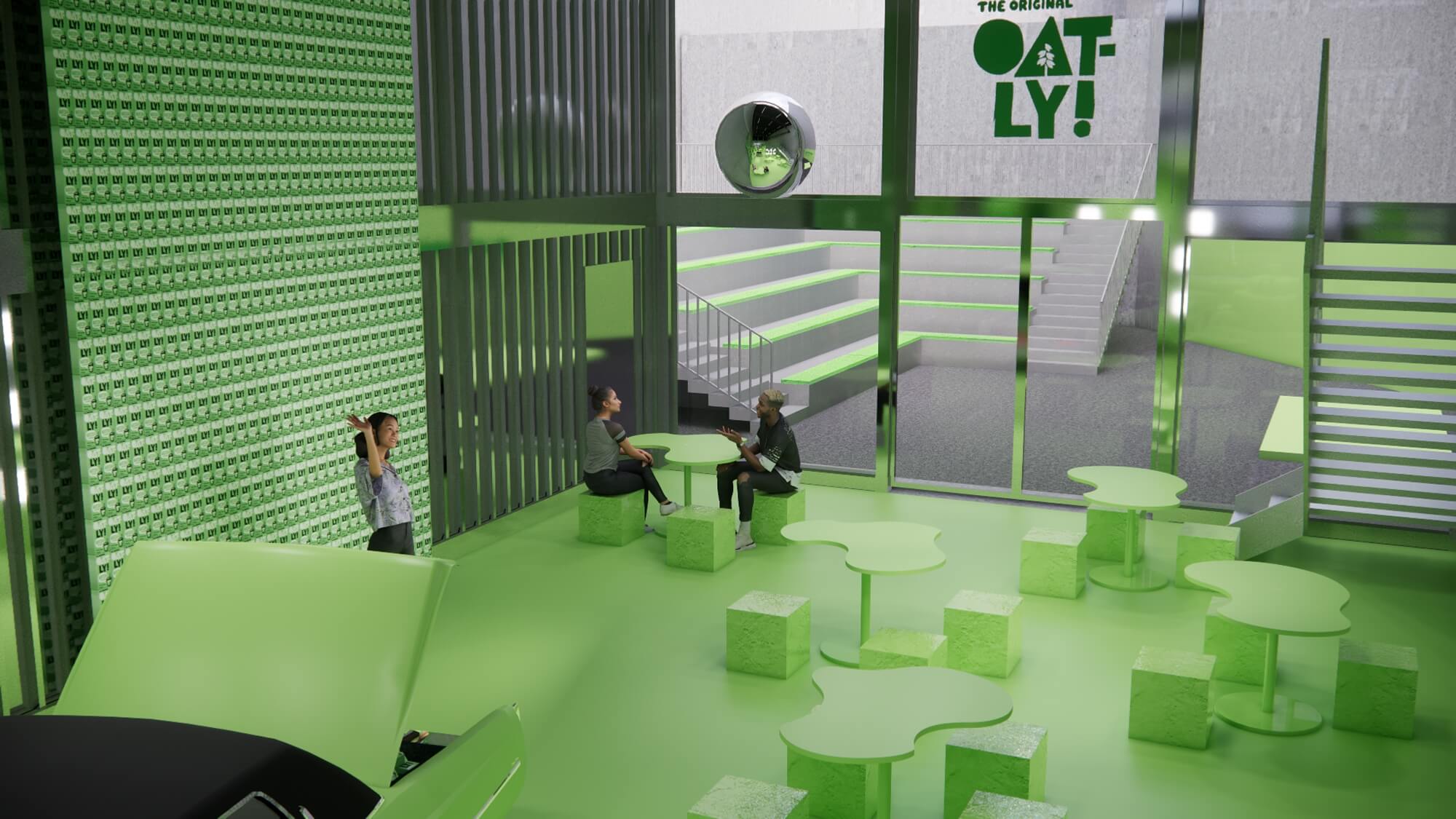
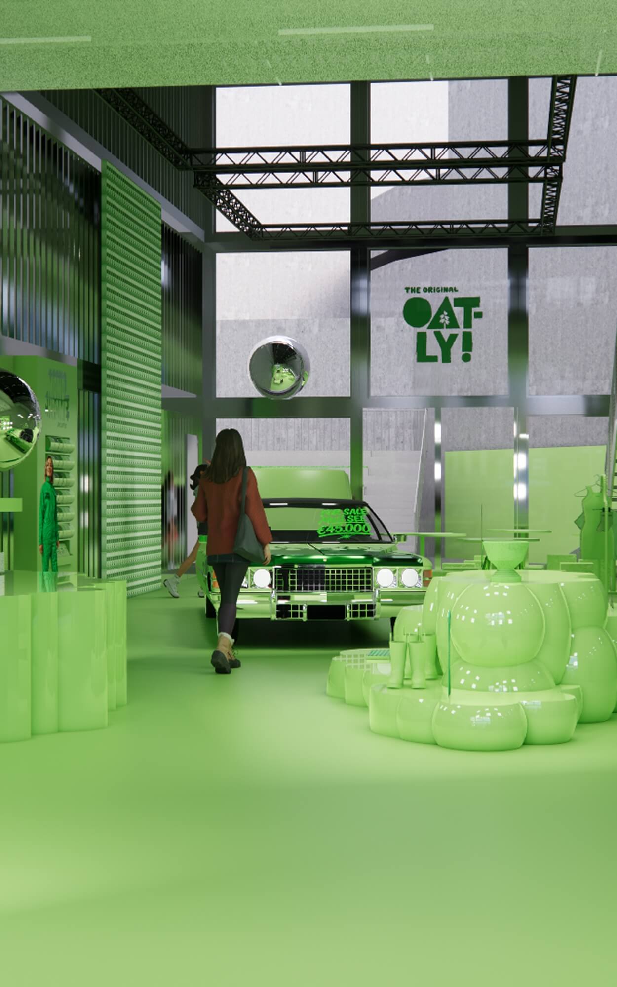
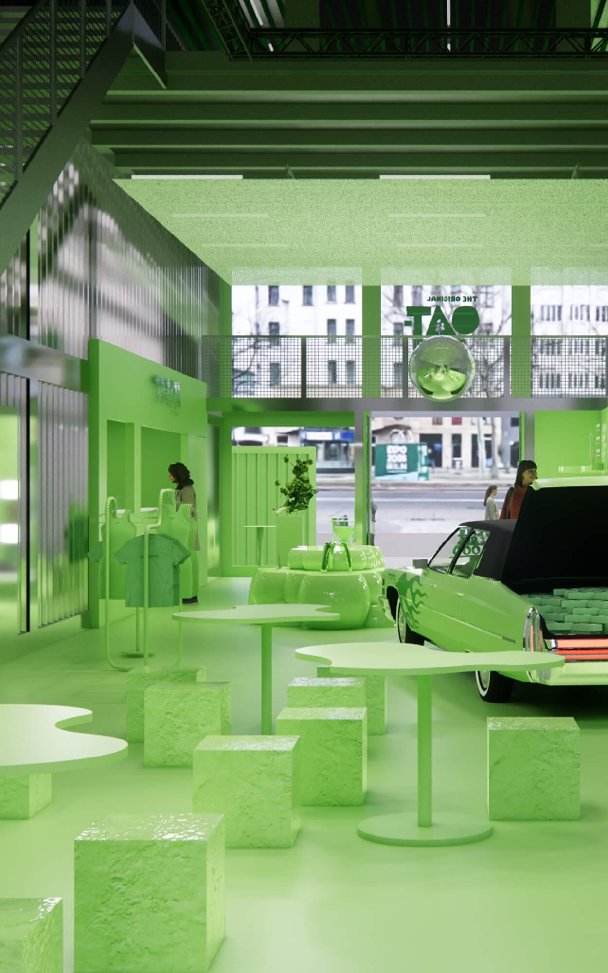
Strategy: Our answer was radically consistent: the greenest of green. Rather than just advertising matcha, we turned the colour itself into a brand experience. We defined a precise green colour range and transformed what was originally a grey retail space into a fully monochrome world. Every object, every product within that space was curated to match — sourced preferably from Berlin-based designers and iconic local references like the Ampelmann, deeply rooted in the city's identity and history. The result was a space where local culture and the Oatly brand world merge seamlessly: deliberate and immediately recognisable.
Solution: The Monochrome by Oatly Pop-up becomes a photogenic stage on the Ku'damm — a pop-up that reads as Oatly Matcha at first glance and generates organic, shareable social media content from every angle. The space became a brand experience, delivering lasting visibility and proving one thing clearly: when design concept and product identity are thought through together, a logo becomes optional.
Client:
Oatly
Location:
Berlin, Germany
Services:
Event Concept, Spatial Design, Experience Design
Year:
2026





More projects


Meeting under the stars
Pride Activation