Work
Compelling brand identities, captivating content, and memorable live experiences: we elevate your brand's visibility across all channels.
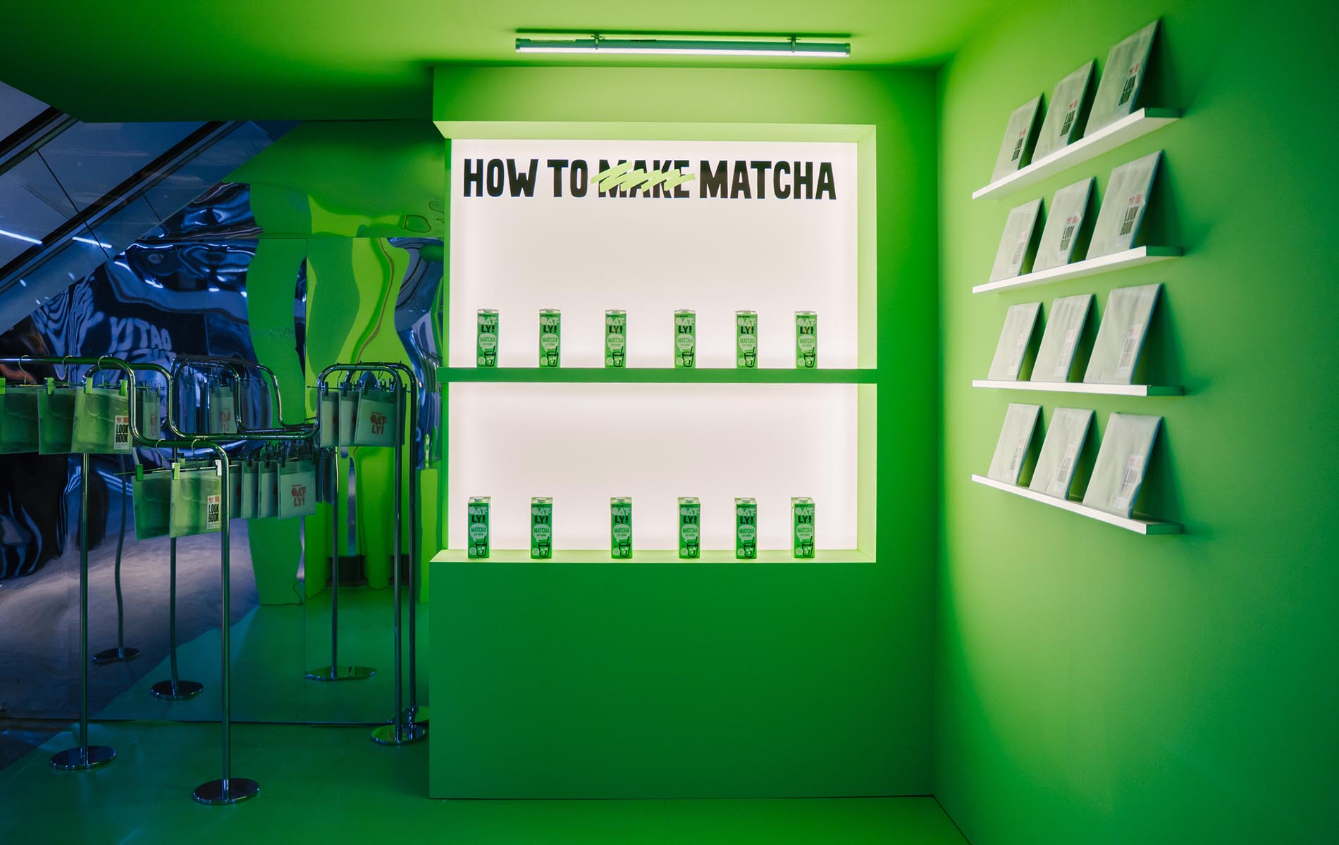
Shaping an Immersive Oatly Space
For the international launch of Oatly’s LOOK BOOK #2 and the new Oatly Matcha, Berlin was chosen as the stage. The challenge: creating an event that authentically reflects Oatly’s playful personality while engaging international guests, influencers, and internal teams alike – and turning the launch into a memorable brand moment.
Strategy: Our approach was to transform CANK Berlin into a fully immersive Oatly universe – a space that sparks curiosity, encourages interaction, and creates emotional connection. The experience was designed in multiple layers: meaningful content (panel discussion), hands-on engagement (workshops), and a strong community finale (afterparty). Spatial design, dramaturgy, and branded touchpoints were crafted to guide guests step by step into Oatly’s expressive and bold identity.
Solution: We oversaw the entire event – from pre-planning to execution – and fully branded CANK Berlin both inside and out. The evening kicked off with a curated panel discussion featuring well-known creators and a moderator, followed by five diverse workshops for the 200 attendees: from nail art and culinary experiences (Coda / René Frank) to “Mix Your Signature Drinks.” Experience highlights included the Conveyor Belt, the Green Room, Heat Light Camera, Matcha Slushies, signature drinks, and hands-on workshop moments.The event culminated in an energetic afterparty with around 500 guests, including international visitors, influencers, and Oatly’s internal community – with DJ sets featuring, among others, Stella Bossi. The result: a launch that made Oatly’s creative spirit visible, tangible, and impossible to forget.
Brand Design, Event Design, Event Management, Photography
Oatly
Event
Branding

Brand Experience for The Center’s 25th Anniversary
The Center at Potsdamer Platz, formerly the Sony Center, is one of Berlin’s most recognizable architectural landmarks. For its 25th anniversary, we developed a month-long creative concept that combined brand experience, placemaking and spatial design. At its core were oversized inflatable Tiergarten Creatures—characters inspired by local animals and expanded with imaginative fantasy beings. They transformed the Center into a friendly, playful environment that encouraged exploration, interaction and shareable moments. Workshops, performances and a city-wide campaign brought the anniversary to life both on site and across Berlin.
Strategy: We developed an immersive activation and experience concept centered around oversized inflatable character figures called the Tiergarten Creatures. Their design draws on real animals from the nearby Tiergarten such as bees and dogs and extends them with imaginative creatures like purple panda bears. All figures were created to be friendly, inviting and highly photogenic. Together, they formed the core of a placemaking approach that transformed the Center into a lively experiential landscape. Weekly workshops, performances and additional activations ensured continuous engagement. A city-wide out-of-home campaign using HYGH screens, wild posters and Berliner Fenster amplified visibility across Berlin. For the visual execution of the figures, we collaborated with artist Mr. Kaplin during implementation.
Solution: The creative concept and experience design we developed turned The Center into a vibrant imaginative world for an entire month. The Tiergarten Creatures became the visual heart of the anniversary and a strong anchor for the entire campaign design. Visitors interacted with the characters, took photos and participated in workshops and activities. We also created a key visual that unified campaign elements, spatial design and communication, giving the anniversary a clear and cohesive identity.
Design, Event Management, Photography, Art Direction
Das Center am Potsdamer Platz
Event
Campaign
Strategy

Storytelling for a Hideaway
Gutshaus Friedenfelde, a collection of three holiday homes with cultural aspirations, needed a new website design to appeal to a younger audience and highlight its versatility as an event venue.
Strategy: We aimed to create a branding platform that sparks inspiration, bringing a contemporary cultural vibe to the historical building while showcasing its unique offerings.
Solution: The fresh web design features vibrant color accents and custom shapes inspired by the architecture and surroundings. A logo that bridges the past and present complements the content designed to inspire potential guests. All of this is presented within a compact website, complete with a booking calendar and a dedicated page for their inhouse music festival Kalit.
Branding, Web Design, Content, Photography, Social Media
Gutshaus Friedenfelde
Webdesign
Branding
Content
Bringing cinematic perspectives to life
How do you make a tech product visible and experiential in a cultural context? The goal was to position the Google Pixel during Art Week exactly where creativity happens: in Berlin’s public spaces.
Strategy: We created an immersive activation connecting technology, film, and urban exploration. The core idea: a curated Art Map and a temporary exhibition space, inspired by the aesthetics of photographer and filmmaker Gia Coppola. At the same time, we ensured the activation reached beyond Cee Cee Berlin’s channels through dedicated photo and video content showcasing the Map and its locations.
Solution: The “Kiosque Pixel” in Kreuzberg became a four-day immersive experience: visitors could watch “Edie,” Gia Coppola’s new art film shot entirely on the Google Pixel 10 Pro, on a multi-screen installation. In addition, the Cee Cee × Google Pixel Art Map in pocket format served as a guide to Berlin’s most cinematic spots: rooftops, off-galleries, cinemas, and light-filled scenes that invite a fresh perspective on the city.
Design, Photography, Copy
Content
Social Media

Kia Proceed Driving Experience
To launch the new Kia Proceed to Europe’s leading journalists, bloggers, and influencers, we created an immersive event experience that turned a product presentation into a moment of cultural impact.
Strategy: Building on Kia’s campaign themes: Daring, Individual, Stylish, and Confident. Our strategy was to transform these core attributes into a physical experience. We selected a dramatic ship hangar as the stage for an unveiling that felt bold, unexpected, and deeply aligned with the ProCeed’s character. Every touchpoint was designed to let guests feel the attitude of the car long before they saw it.
Solution: We brought the concept “The Arrival of the New Kia Proceed” to life through a contemporary, container-inspired environment filled with neon accents, tropical elements, mirrored surfaces, and striking brand colours. The highlight: the ProCeed hidden beneath a full-size shipping container, revealed through a dramatic lift moment. After the reveal, the outdoor hangar transformed into a lively social playground with food stands, a bar, a dance floor, and interactive experiences, from a live tattoo station to a selfie tunnel, each representing one of the car’s signature traits.
Brand Strategy, Brand Design, Art Direction, Design
Kia Europe
Branding
Strategy
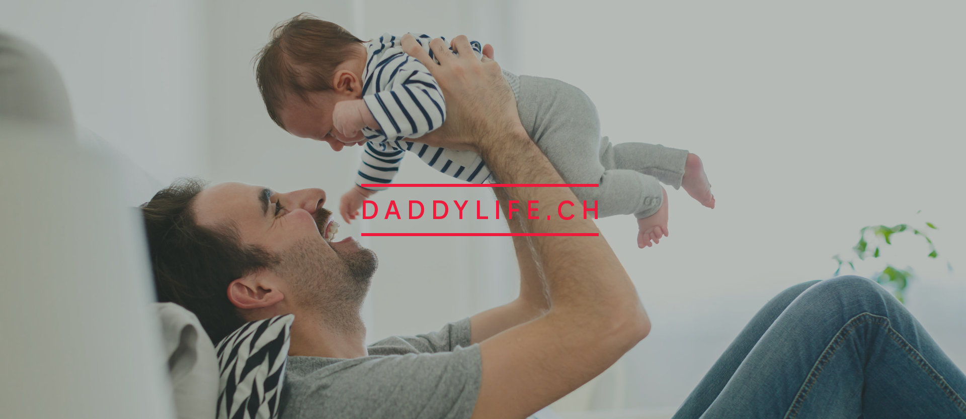
Papiseite - Modern Fatherhood, Told Digitally
The Daddylife project was commissioned for SwissLife, one of the largest Swiss insurance companies.
Strategy: The aim of the project was to conceive, design and copywrite a modern microsite tailored to young fathers, which serves as a platform for a potential target group survey.
Solution: In addition to the one-pager site with an integrated feedback and select area and order form, the concept also included an integrated blog with topics relating to becoming a father. We provided comprehensive support for the project, from logo development and conception to UX design for the website and animated banners, programming and content creation (text and image editing).
Design and Content
Swiss Life
Branding
Strategy

Leveling Up an Industrial Site
How to build anticipation and tell the story of a cutting-edge campus soon to rise on an industrial plot? Berlin Decks' location offered both opportunity and challenge.
Strategy: It had to be bold from day one. The goal was to create visibility and buzz even before construction. Our approach included temporary installations, local community integration, and on-site communication.
Solution: A dynamic logo design, inspired by shipping containers, reflects the campus’s versatility. Bold orange and soft pink tones symbolize industry meeting digital innovation, forming the visual identity that spanned from temporary tape art to murals and overall branding – an approach that made an industry-wide impact.
Strategy, Naming, Branding
BEOS AG
Branding
Strategy
Webdesign

Escape from everyday life
An exclusive vacation destination needed an identity that perfectly combined closeness to nature with modern comfort and appealed to discerning travelers and nature lovers alike.
Strategy: Our goal was to present stories waiting to unfold—a visual and emotional narrative that highlights the cool architecture, breathtaking location on the Baltic Sea, and a sense of warmth and vibrancy that invites guests to imagine themselves having an unforgettable experience.
Solution: A standout look that sets Newhaus apart as a unique vacation oasis. We started with a sleek, minimalist logo inspired by the architecture and paired it with a series of vibrant, whimsical flags that pay homage to the nautical setting. Photos taken on location capture the essence of the place and the endless possibilities. The result? A website and suite of communications resources that deliver a holistic experience and convey the Newhaus atmosphere with clarity and charm.
Branding, Content & Social Media
Newhaus
Branding
Webdesign
Content

A Visual Identity for a Mediterranean Hideaway
In the north of Mallorca lies the private holiday home, Can Miret. The house, which is in traditional Mallorcan style with a garden and pool, has been painstakingly transformed by the owners into a stylish and modern holiday home.
Strategy: The task of cee Cee Creative was to make Can Miret visible and create a look & feel that would suit the target group and reflect the property’s highly personal character. We sought to capture the Mediterranean warmth and the charisma.
Solution: The solution was to create a warm palette of colors that depicted the world between the house, its garden and the landscape, the pool and sea and irregular, imperfect forms as design elements. We wanted the logo to have an analog aesthetic, so we developed a hand-drawn word mark. We combined a simple sans serif typeface with a in typewriter-style font, representing “the beautiful, simple life” that a holiday at Can Miret offers. The new design was used for the creation of a website, a printed brochure and postcards. We complemented this with a visual language combining photos of the house, estate and surroundings and text content for website, marketing-materials ans social media.
Consulting, Design, Content, Social Media Management
Can Miret
Branding
Content

Redefining the City Center
For the 25th anniversary, the Potsdamer Platz Festival was held as an open event for all, celebrating the space and Berliners. We developed the concept and managed branding, communication design, event assets, and documentation, including a microsite and visuals to create a seamless experience across all touchpoints.
Strategy: To create a dynamic festival corporate identity (CI) that connects with the mother brand while establishing its own distinct look and feel, appealing to a wide audience, including families, neighbors, and tenants. The main goals were to maximize visual impact and provide a versatile framework for creating collateral across the four zones, including signage and wayfinding. The concept was also extended into a comprehensive website design showcasing the full program.
Solution: A fresh and friendly corporate identity was developed, drawing from elements of the mother CI such as fonts, but enhanced with custom-made shapes and a bespoke color palette. Four hand-drawn shapes became the core of the corporate identity, each representing one of the festival's four different zones. Simple animations brought the key visual to life on digital screens, while the shapes and colors were applied to facilitate on-site navigation and organize information on the website.
Event, Branding, Campaign, Social Media, Photography, Webdesign, Content
Brookfield Properties
Event
Branding
Campaign

Creative Content for Cultural Players
Berlin’s cultural scene is packed with things to see and do. But how can this richness be shared globally on limited budgets and small teams?
Strategy: We launched a pilot MVP to test the concept and build momentum. Key components included a new platform, shareable content packages for cultural players, and a launch event to spark networking and visibility.
Solution: The name "Into Berlin" captured the platform's essence — inviting people to dive deep into the city’s cultural scene. With a contemporary web design as the central hub, we showcased curated content directly from Berlin’s venues and artists. Prioritizing digital engagement, we created teaser-style visuals, along with short stories and snippets perfect for sharing across social channels. The goal: compelling content that grabs attention and spreads widely.
Event Design, Webdesign, Naming, Content Production
Visit Berlin
Webdesign
Content

Moving Mobility Into Tomorrow
Swiss-based mobility service Clyde needed a fresh start: its outdated image and impersonal design were limiting the brand’s potential. The goal was to inspire people to embrace a new mobility concept and drive success through a revitalized brand identity.
Strategy: In focus were the values of “Friendly, Seamless, Simple” and as the project evolved, these values crystallized further into “Simple, Inspiring, Flexible.” The brand strategy gained traction: Clyde was designed to “simply take everyone along.”
Solution: We came full circle with Clyde’s new corporate identity: the “C” became the hero, embodying a friendly, forward-moving vibe with its rounded design. An inviting color palette set a positive tone, and custom illustrations brought lightness to complex offerings and benefits. Now, Clyde is circulating across Switzerland with a bright, approachable personality, making car subscription feel as easy as hitting the road.
Strategy, Branding, Marketing, Webdesign, Content
Clyde
Strategy
Branding
Marketing

Disrupting Mobility Branding
When MILES came to life, no other mobility brand embraced such a bold, lifestyle-focused, and human-centered personality. Our challenge: How to accelerate the transformation to position the brand as a disruptor in a competitive market?
Strategy: Encourage consumers to choose the most exciting companion rather than just the most affordable option. We identified potential through a lifestyle-centered approach, showcasing the brand with bold design and memorable messaging that resonates with the audience.
Solution: We created a corporate identity as casual and approachable as a streetwear brand. The logo’s rounded corners evoke friendliness, while its dynamic angle symbolizes drive and progress. Paired with a retro font, the design reflects simplicity and convenience. The result: a cool companion for your city adventures.
Strategy, Naming, Branding, Copy, Content
MILES Mobility
Strategy
Branding
Content
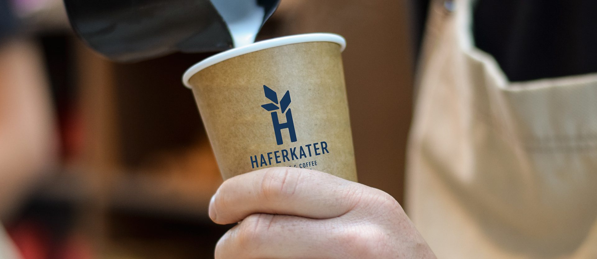
Haferkater
Consulting, workshop and full rebrand for successful porridge and coffee focused group of cafes in Berlin.
Design, Consulting
Haferkater
Branding
Content
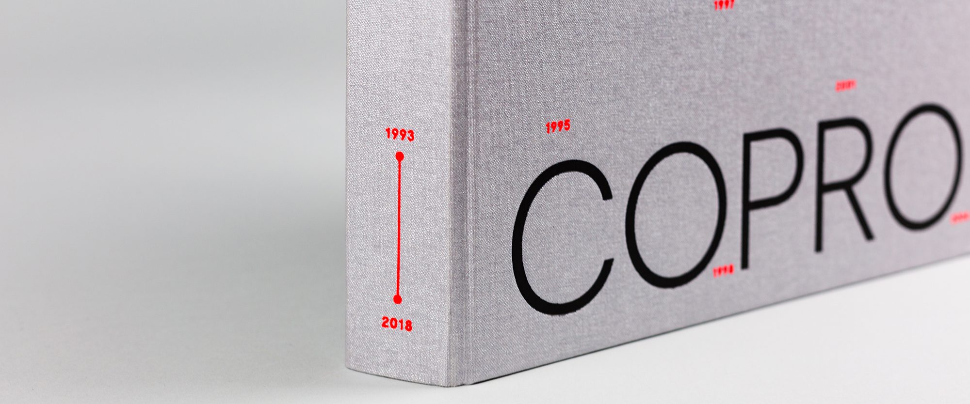
Copro Edition 25 – Editorial
This elaborate book was produced to mark the 25th anniversary of the project development company Copro. The book is intended as a thank you and gift to colleagues, friends, customers, and partners. It also aims to give the projects of the last 25 years their own space—the architecture, but also the artistic interventions.
Strategy: The challenge was to present art and architecture side by side and create a visually exciting contrast. Interviews with the owners and short interviews with companions complement the content concept. The original idea for the design was to pay tribute to the anniversary.
Solution: The result is a book in a square format measuring 25x25cm, which also matches Copro's own square logo. The high-quality silver linen cover emphasizes this idea. As a contrast to the rough, shimmering materiality of the cover, the title was embossed in black in a straightforward Moderat font — symbolizing the impression Copro has made in recent years. Each individual year of the two and a half decades from 1993 to 2018 was also given space on the cover: the individual numbers were screen-printed in neon orange. The special color also runs through the interior of the book — as a visual guide and highlight. In combination with one of the company's CI colors, metallic blue. Another special highlight of the book is the endpaper with abstract city maps showing the two locations of Stuttgart and Berlin as a bracket for the work. To emphasize the individual character of the projects, each building was given its own chapter with an individual color, visually placing it in brackets. A neon orange bookmark was included as an addition, allowing readers to mark their favorite project.
Design
Copro
Branding
Strategy

Celebrating Coffee Culture
Coffeeweek stands for the diversity of coffee culture and combines enjoyment with a desire to discover. The challenge was to both create an appealing platform and an community-driven event concept that inspires and excites coffee lovers and industry experts alike.
Strategy: The aim was to showcase the dynamism and diversity of the coffee world both online and offline. A lively, appealing design and a captivating event experience were to create a positive user experience and arouse enthusiasm for coffee.
Solution: A contemporary website built with Webflow designed with bold colors and clear typography gets to the heart of the coffee culture. High-quality images and interactive elements ensure an appealing appearance. The event was designed with the same care to provide an immersive and unforgettable coffee experience. The combination of informative content, inspiring design, and an engaging event has established Coffee Week Berlin as a leading platform for coffee connections.
Strategy, Branding, Social Media, Event, Photography
Coffee Week Berlin
Branding
Event
Social Media
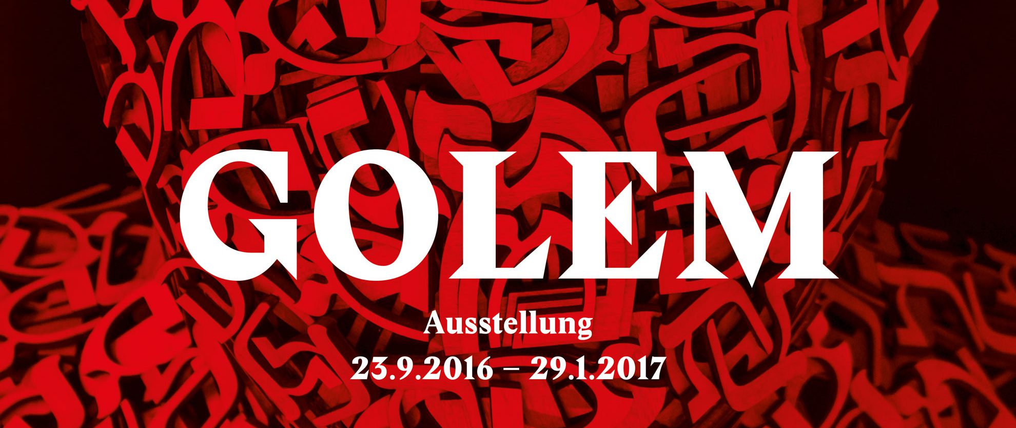
Jüdisches Museum Berlin — Exhibition “Golem”
For the special exhibition GOLEM at the Jewish Museum Berlin, we designed the accompanying publication and developed and designed the concept for the entire marketing campaign—from invitations and posters to facade banners.
Concept, Branding, Design
Jüdisches Museum Berlin
Branding
Strategy
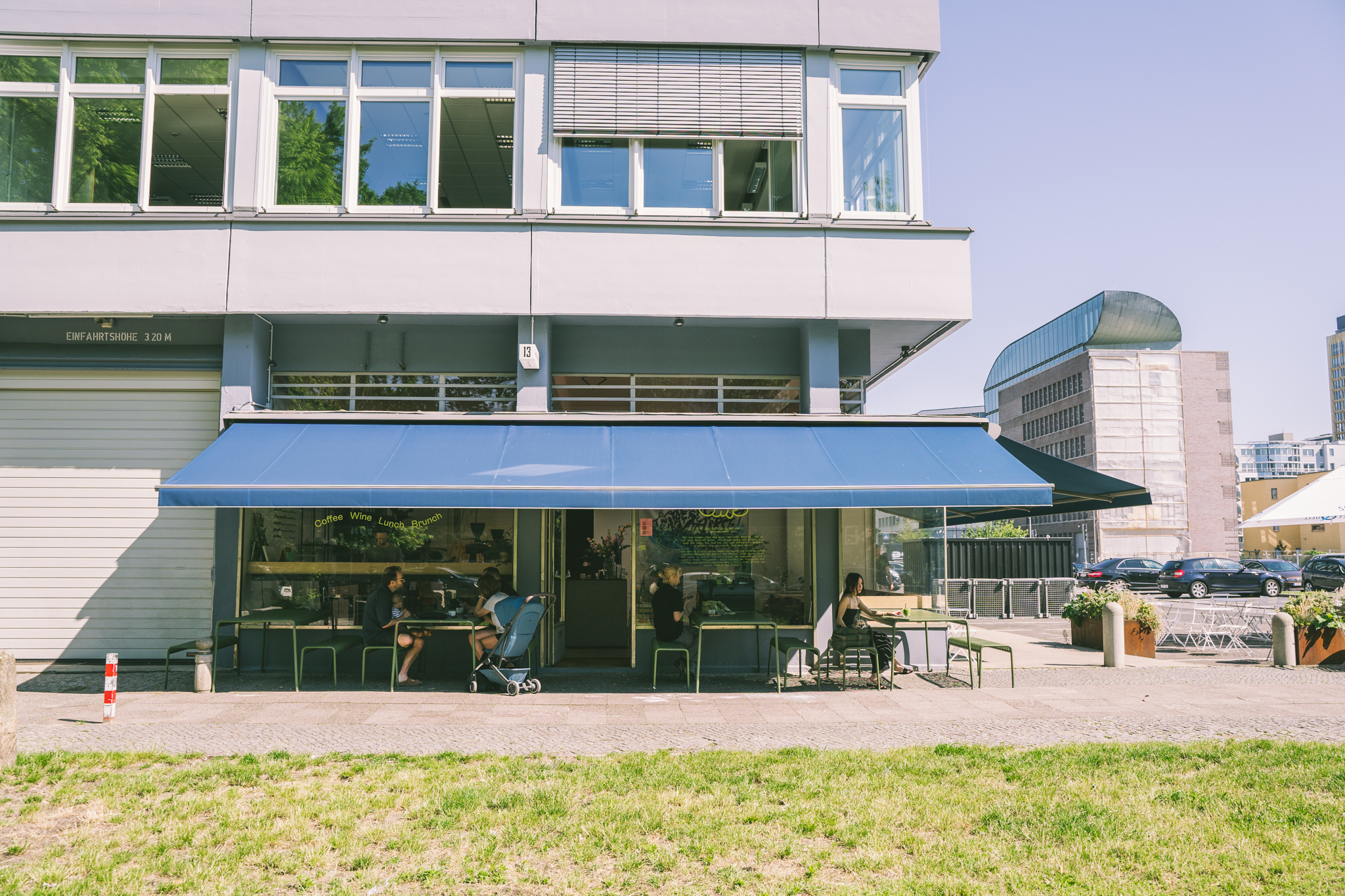
Cee Cee Café
Cee Cee Cafe
Event, Strategy, Content, Design
Cee Cee
Branding
Marketing
Event

Creating Must-have Moments
Potsdamer Platz has transformed, offering new and exciting experiences. While it’s a Berlin landmark known to all, how do we inspire people to rediscover it? And how do we talk about the place without focusing on individual tenants?
Strategy: We centered on three main pillars of Potsdamer Platz: Shopping, Entertainment, and Food & Drinks, targeting a variety of audiences. The concept design paired bold messaging with vibrant photography to capture memorable moments that invite people to visit Potsdamer Platz.
Solution: We launched a five-motif campaign shot on-site, featuring select locations around the premises. Photographer Bastian Thiery captured distinctive moments up-close. The campaign was displayed as split-screen or full screen takeovers in the Potsdamer Platz subway, and on mega boards and city lights across the city.
Campaign, Strategy, Content
Brookfield Properties
Campaign
Strategy
Content
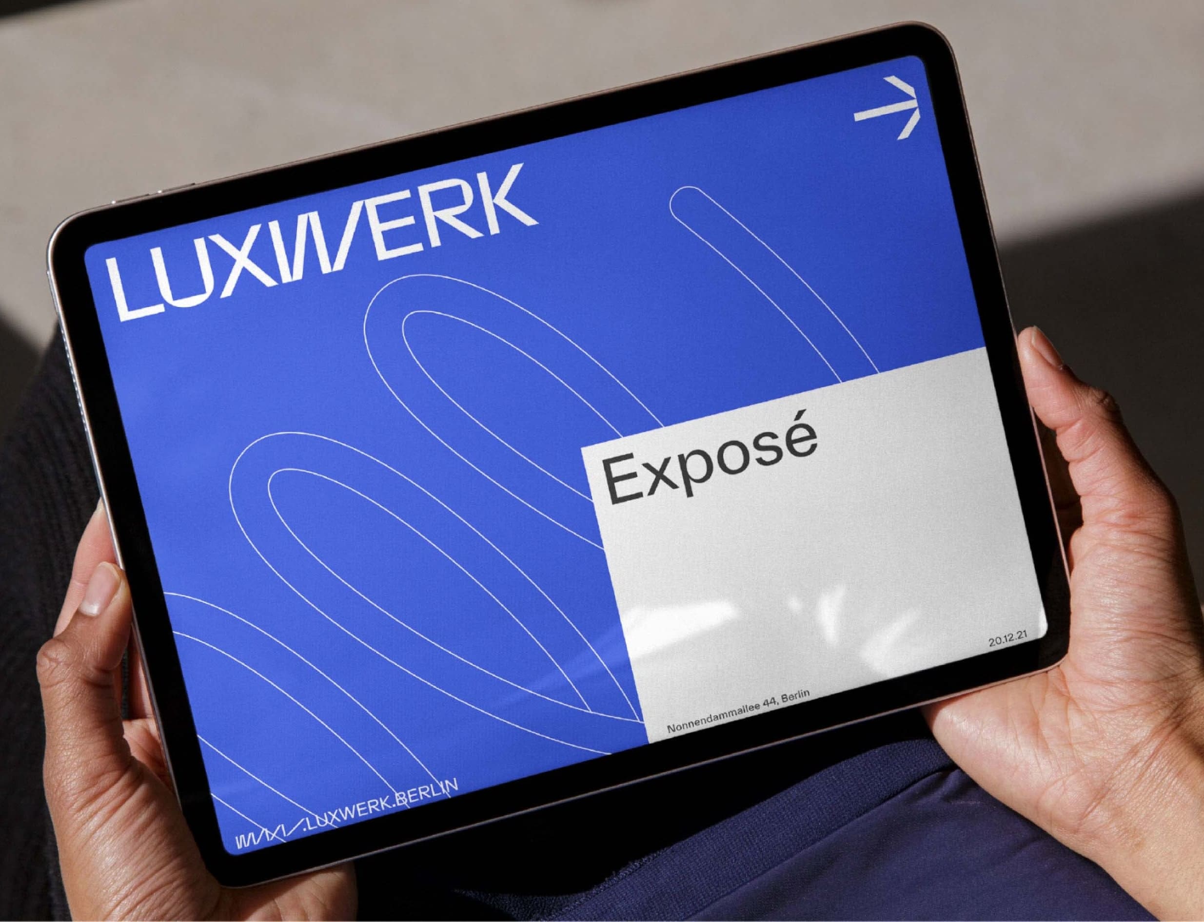
Bold Branding for Berlin’s New Innovation Campus
LUXWERK’s bold corporate identity promotes a new Berlin innovation campus. Honoring its light bulb legacy, the name bridges past and future, with dynamic designs and vibrant blue visuals showcasing a space where anything is possible.
Strategy
Develop a strong corporate identity through a name that resonates and a graphic approach that is both bold and tech-savvy yet simple. This includes crafting a positioning paper and establishing a comprehensive identity ready to support all communication needs, bringing the vision of the space to life even before construction begins.
Solution
We initiated the project by creating a new brand identity with a fresh name: LUXWERK. This name honors the legacy while bridging the past and present- Dynamic outlines add momentum to the corporate identity, making the flexibility of the site tangible. A vibrant digital blue takes center stage, transforming the space into a 'blue box' where anything is possible!
Brand Strategy, Art Direction, Brand Design
Aventos Management GmbH
Branding
Strategy

Meeting under the stars
An open-air experience that blends film, community and brand experience. With the Moonlight Movie Night, Cee Cee created an open-air experience for Hinge that translated a digital brand moment into a real community encounter. Instead of swipes and screens, the focus shifted to real-world presence and authentic togetherness. In Berlin and Hamburg, we designed an atmospheric space where film culture and community activation meet, making Hinge’s brand promise tangible. The Moonlight Movie Night combined content, event design and social media into a cohesive brand experience that created closeness and encouraged meaningful moments.
Strategy: Hinge, the dating app designed to be deleted, wanted to bring their new campaign film into the real world and spark genuine offline connections within their community. The goal was to move beyond digital interactions and create an experience that makes the brand claim tangible. We developed an open-air experience centered around the rom-com Palm Springs and launched a cross-media campaign to activate the event in Berlin and Hamburg. Through targeted city touchpoints, social media and community building, we reached the right audiences and created moments of real-world togetherness.
Solution: Cee Cee crafted the entire Moonlight Movie Night journey, from awareness-building announcements to an immersive and memorable cinema evening. Together with Hinge, we created reach, strengthened emotional engagement and placed real-world connections at the center of the brand experience.
Content, Event Design, Event Management, Photography, Social Media, Naming
Hinge
Event
Content
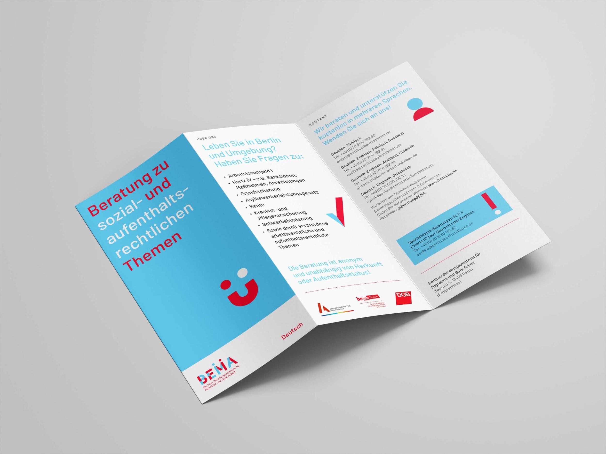
BEMA – Branding and Design
BEMA – Branding und Design
BEMA - Berlin Beratungszentrum für Migration und Gute Arbeit
Branding

Spreading Cross-Cultural Connections
How to engage a new audience for the Dommuseum Hildesheim? The goal was to create a striking campaign and exhibition design for “Islam in Europe: 1000–1250,” offering a fresh perspective on the interrelations of religion and culture.
Strategy: We aimed to create a key visual that would be unmissable on the streets of Hildesheim and beyond. This involved rolling out essential elements throughout the exhibition in collaboration with the exhibition design studio Schröder Rauch.
Solution: By bridging exhibition pieces with contemporary fonts and a striking yellow color palette, the main visual became the leitmotif of the show. This set the tone for all marketing materials and the graphic elements of the exhibition design.
Branding, Design
Dommuseum Hildesheim
Branding
Campaign
Marketing
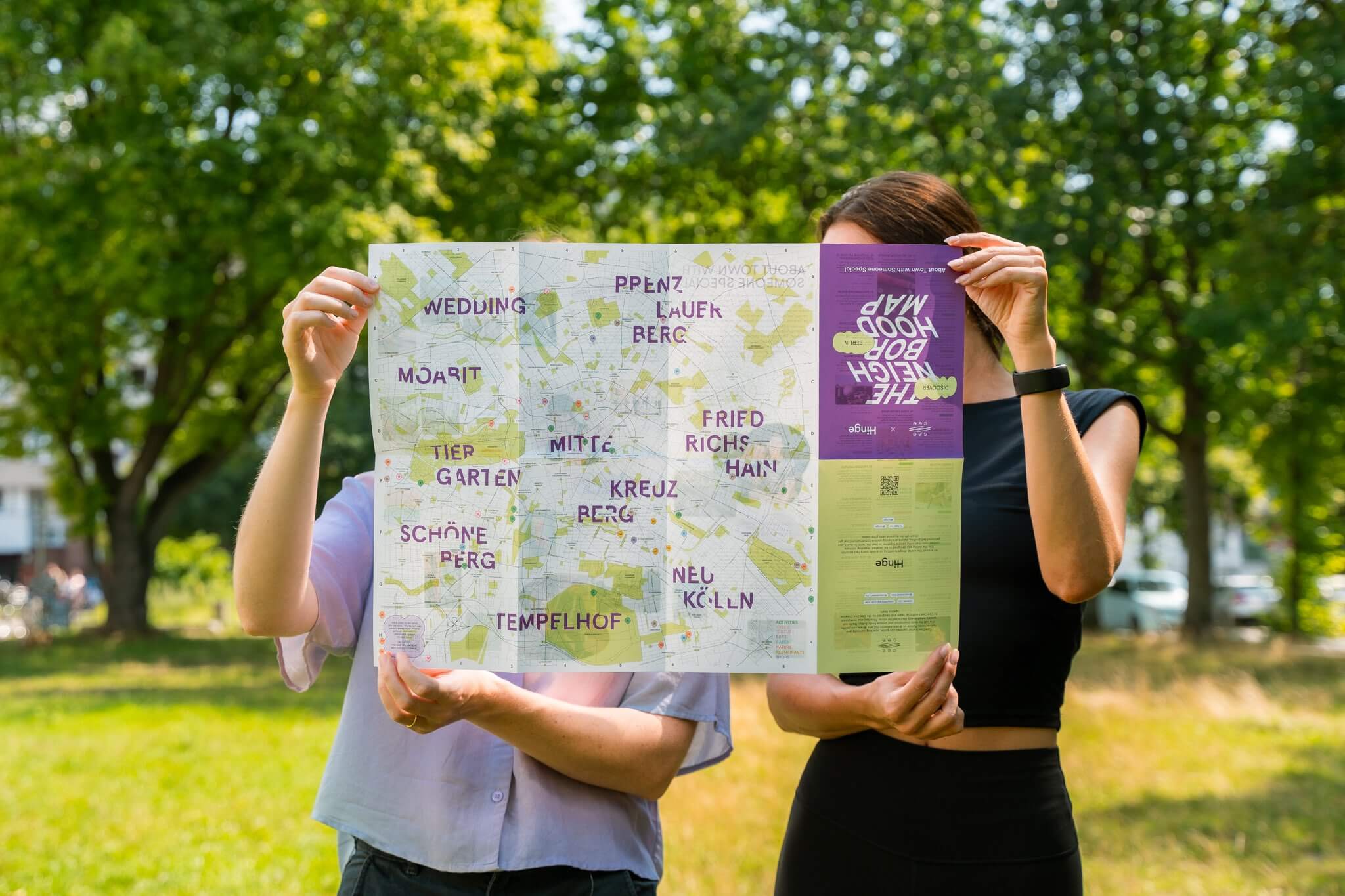
Hinge Neighbourhood Map
Hinge Neighbourhood Map
Content, Editorial, Photography
Hinge
Content
Social Media
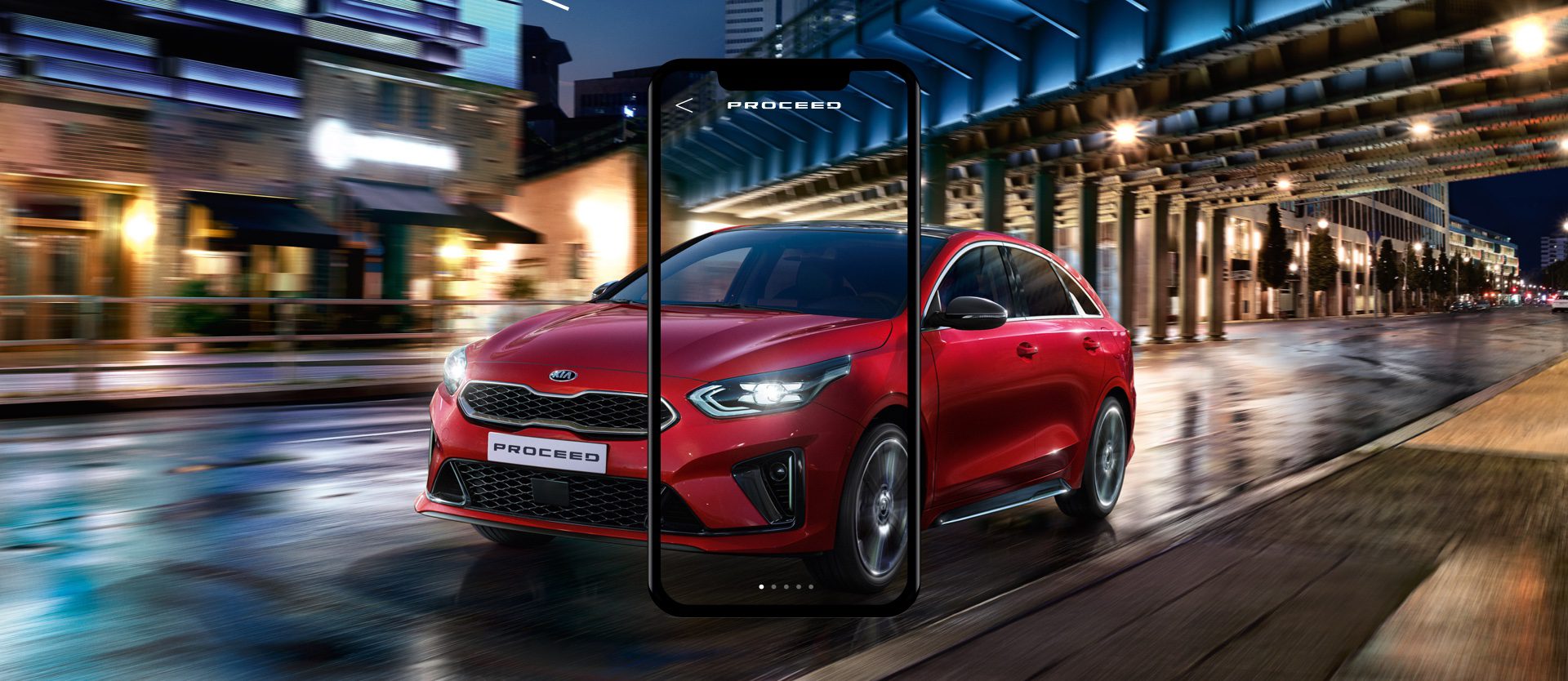
Kia Experience App - UI/UX Design
UI Design for the KIA’s Experience App, which was used for the KIA Proceed Test Drive, Barcelona
UI/UX Design
Kia Motors Europe
Strategy
Webdesign

Balancing dualities
Named after its home on Erasmusstraße in Moabit, RASMO embodies the spirit of Berlin—a city steeped in history yet brimming with forward-thinking innovation. This project combines ambitious sustainability goals, flexible workspaces, and contemporary design to honor its heritage while shaping the future.
Strategy: RASMO is a place of contrasts. Our vision was to create a corporate identity that balances these dualities: down-to-earth yet refined, approachable yet bold. Breaking away from conventional real estate communication, RASMO embraces a “Kiez Gedanke” (neighborhood spirit) approach, avoiding overly polished architectural jargon. The emphasis lies on fostering connections among tenants—symbolized by thoughtfully designed outdoor spaces and architecture that bridges the old and new parts of the building. This unconventional approach reflects RASMO’s ambition to create not just a building but a vibrant community where history and innovation coexist in harmony.
Solution: The RASMO identity is built around a bold logo, complemented by a friendly, vibrant color palette. The design language takes inspiration from the dynamic interplay between the building’s various sections. Overlapping rectangular forms with precise indentations guide the viewer's eye and organize content effectively. This modular system offers endless creative possibilities, ensuring every layout is as unique as the location.
Naming, Logo Design, Branding, Copywriting, Editorial
INBRIGHT
Branding
Content
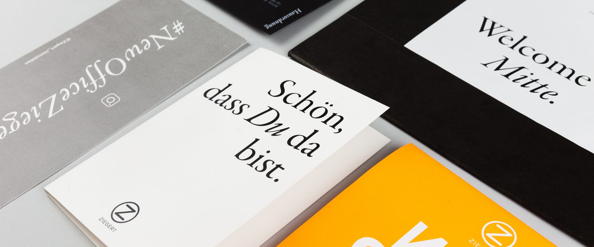
Ziegert’s New HQ Welcome Experience
Welcome to your new neighborhood! With this project we were tasked with conceptualizing and designing a welcome package for real estate company Ziegert to mark their relocation and welcome employees to the new headquarters in Berlin Mitte.
Inspired by the concept of the iconic brown paper lunch bag, we put together a package that includes important onboarding information, highlights of the new office space and a welcoming message from the board members. As we believe that a good working environment is not just about the physical office, but also its surroundings, we included a Cee Cee Neighborhood Map to inform employees about the best lunch spots in the area or tips on exploring their new kiez. We adjusted the existing Cee Cee Mitte/Kreuzberg map to match the corporate style, visual identity and fonts and used Pantone’s Neon Orange for a refreshing pop of color. We combined all deliverables into an elegant black Granit bag, customized with a welcoming message sticker, that is both informational and aesthetically pleasing.
Brand Strategy, Brand Design, Art Direction, Design
Ziegert Immobilien
Branding
Strategy
Pride Activation
Zalando Pride Activation
Campaign, Strategy, Content
Zalando
Campaign
Strategy
Content
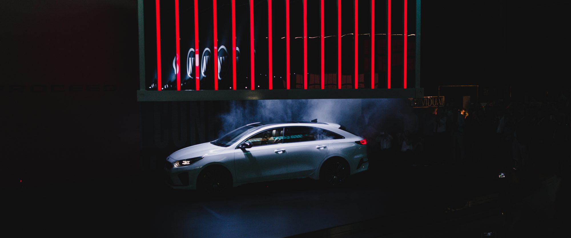
A Multi-Layered Experience for the Kia ProCeed
For the European launch of the new Kia ProCeed, we created an immersive brand experience that brought the car’s core attributes—daring, individual, stylish and confident—to life. Set inside an industrial shipyard hangar, the event combined dramatic staging, thematic experience zones and a bold reveal moment designed to captivate press, bloggers and influencers alike.
Strategy: The task was to develop a unique and unforgettable event experience for the launch of the new Kia ProCeed in front of European press and selected bloggers and influencers.
Solution: Under the banner “The arrival of the new Kia ProCeed”, the event took four key product characteristics from the marketing campaign – daring, individual, stylish and confident – and put them center-stage. For the car’s unveiling, a distinctive venue was chosen in the form of a shipyard hangar. Inside, we created a contemporary look that expressed the four concepts, utilizing large shipping containers, mirrored surfaces, tropical plants, neon signs and colors from the key event visual. Outside, shipping containers provided temporary spaces while the main star of the event, the new Kia ProCeed, remained hidden beneath a container before being dramatically unveiled as the container was lifted. After the unveiling, the outdoor space was transformed with a bar, food stands and a dance floor. As additional entertainment, visitors could take part in an experience program reflecting the four themes: a live tattoo station (daring), a hairdressers (individual), a selfie tunnel (stylish) and a photo wall (confident).
Concept, Design, Content
Innocean / Kia Motors Europe
Event
Branding
Strategy

Stay in the loop — subscribe to our studio news.