Moving Mobility Into Tomorrow

Clyde.
Swiss-based mobility service Clyde needed a fresh start: its outdated image and impersonal design were limiting the brand’s potential. The goal was to inspire people to embrace a new mobility concept and drive success through a revitalized brand identity.
Strategy: In focus were the values of “Friendly, Seamless, Simple” and as the project evolved, these values crystallized further into “Simple, Inspiring, Flexible.” The brand strategy gained traction: Clyde was designed to “simply take everyone along.”
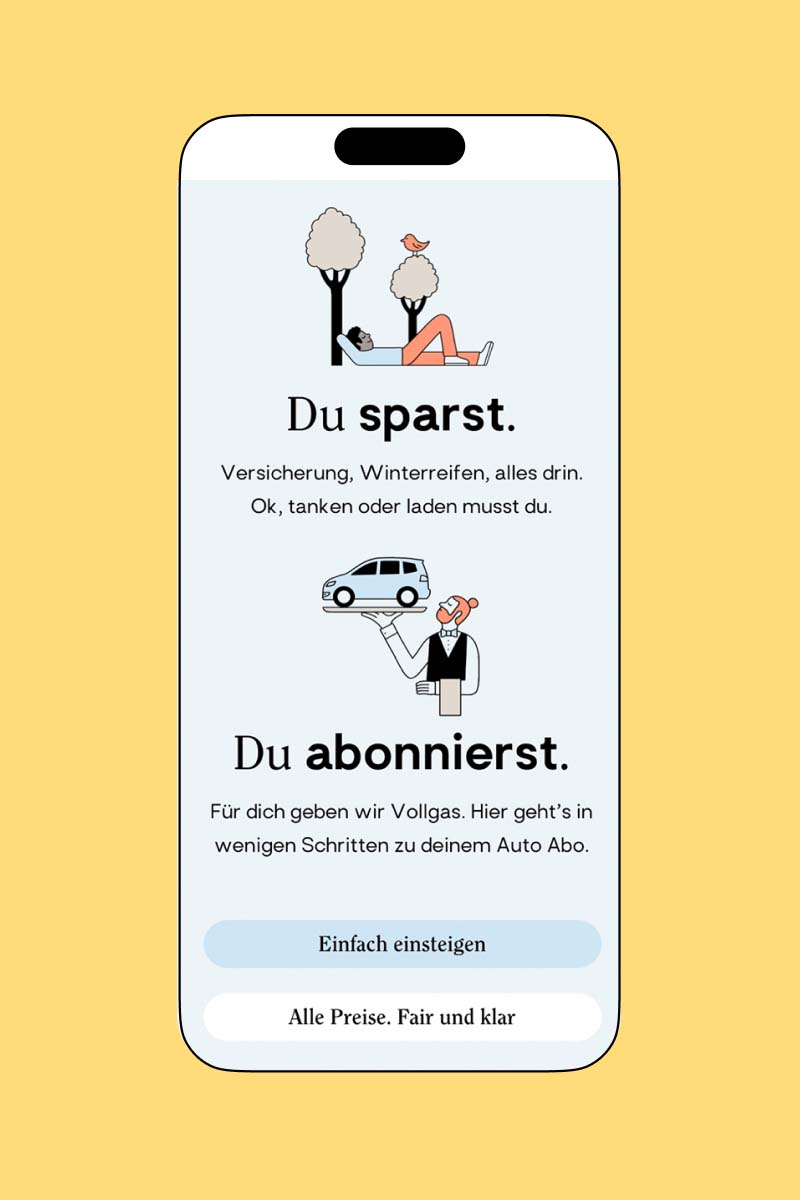
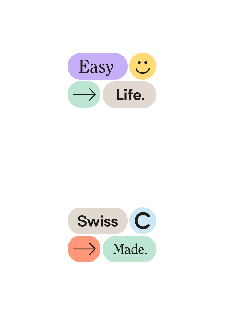
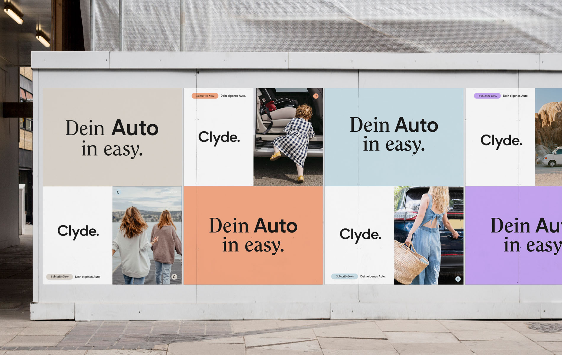
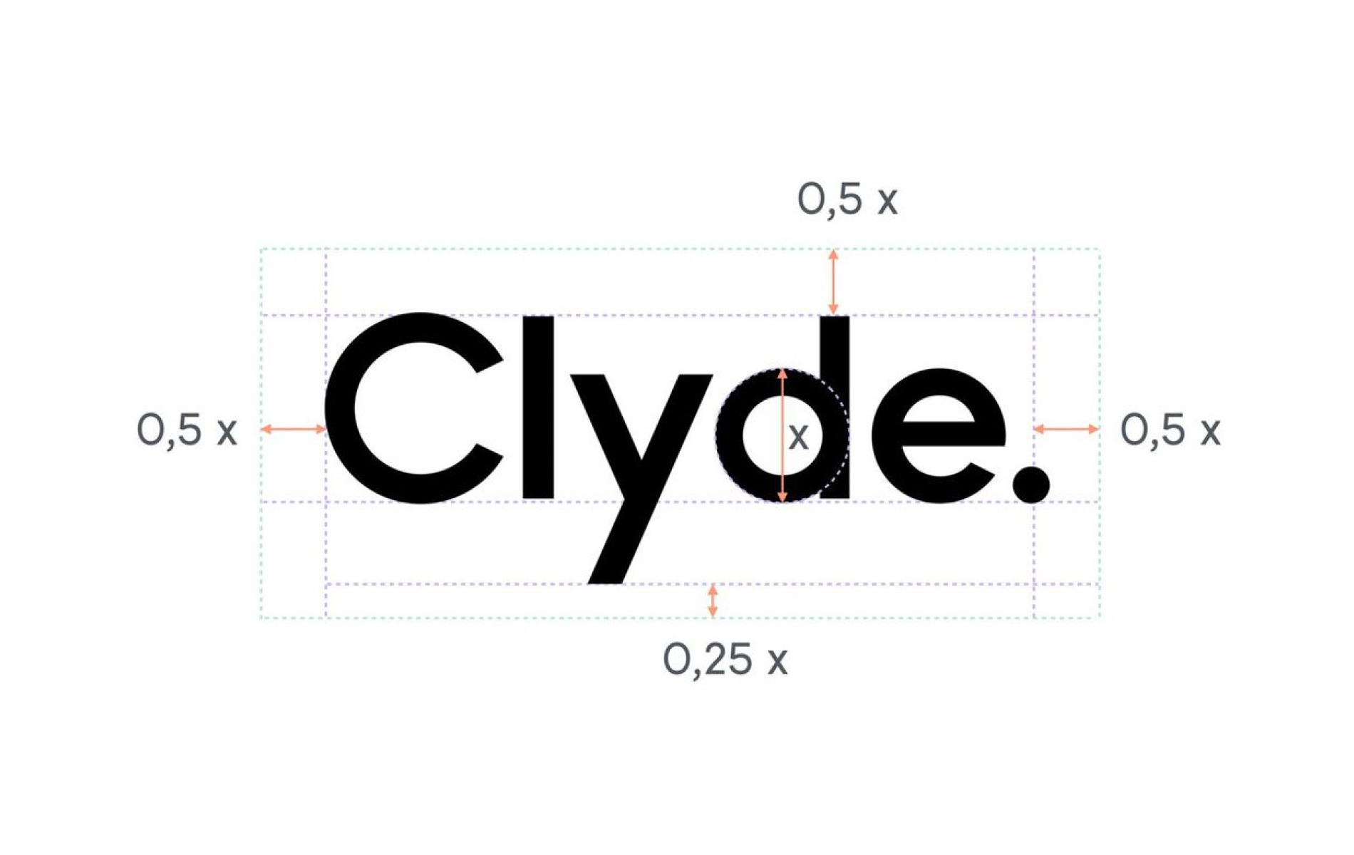
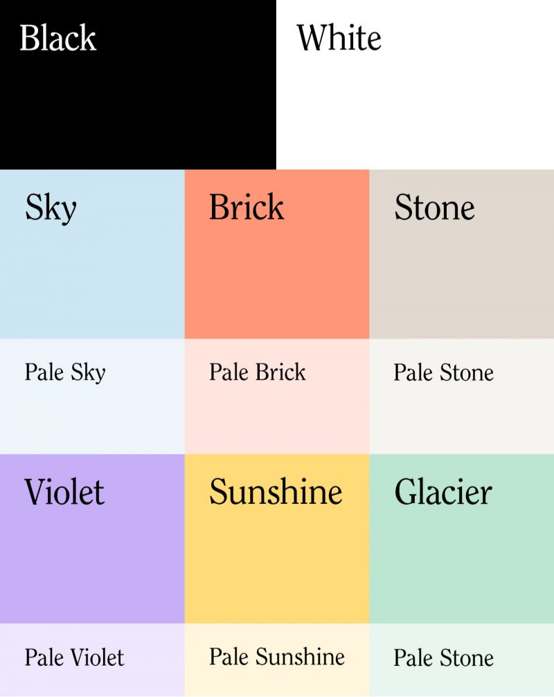
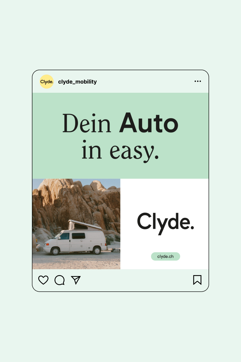
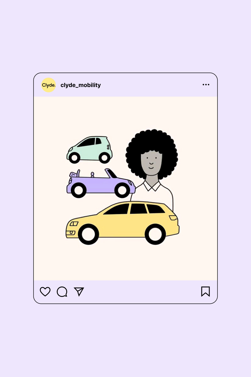
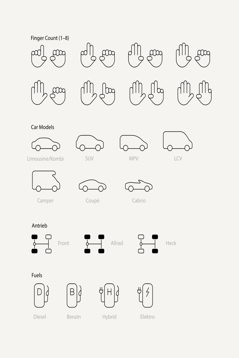
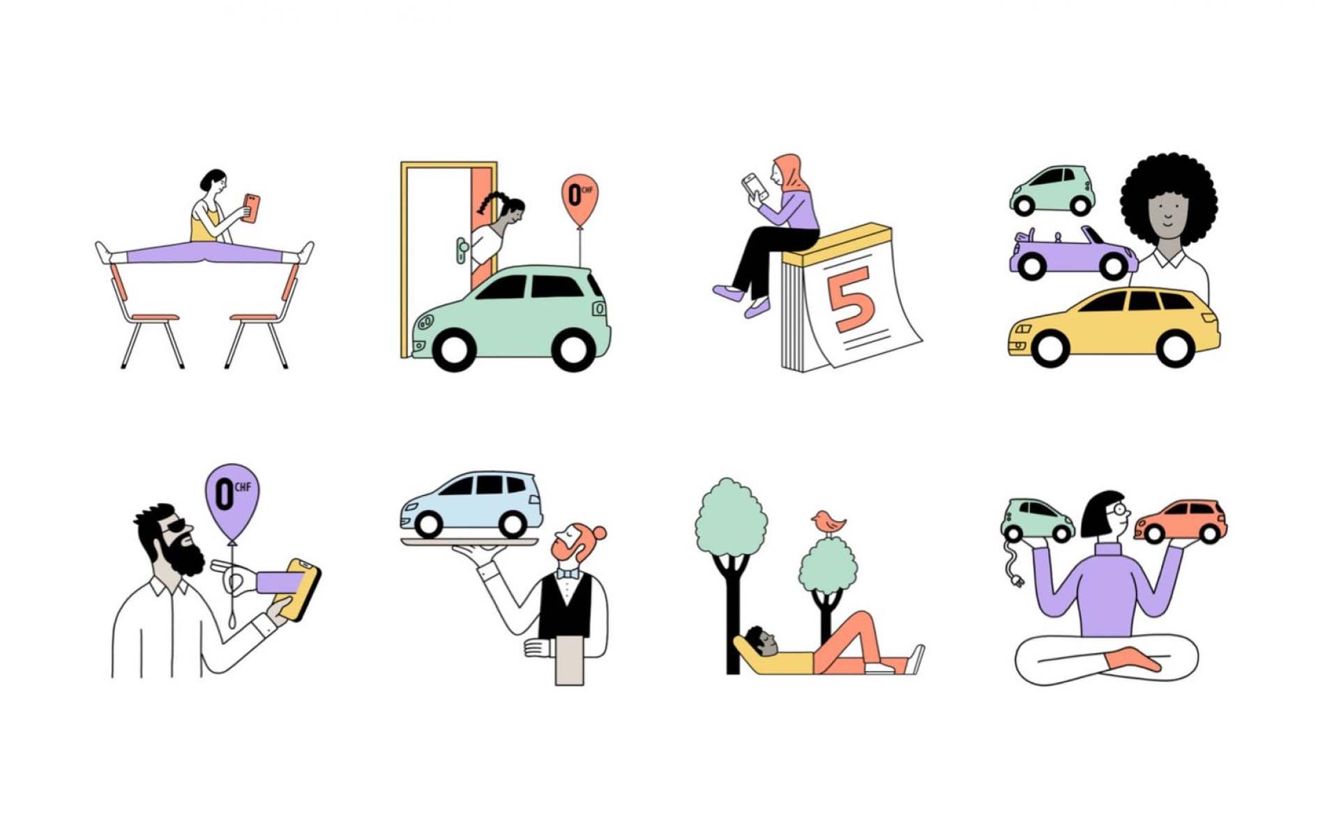
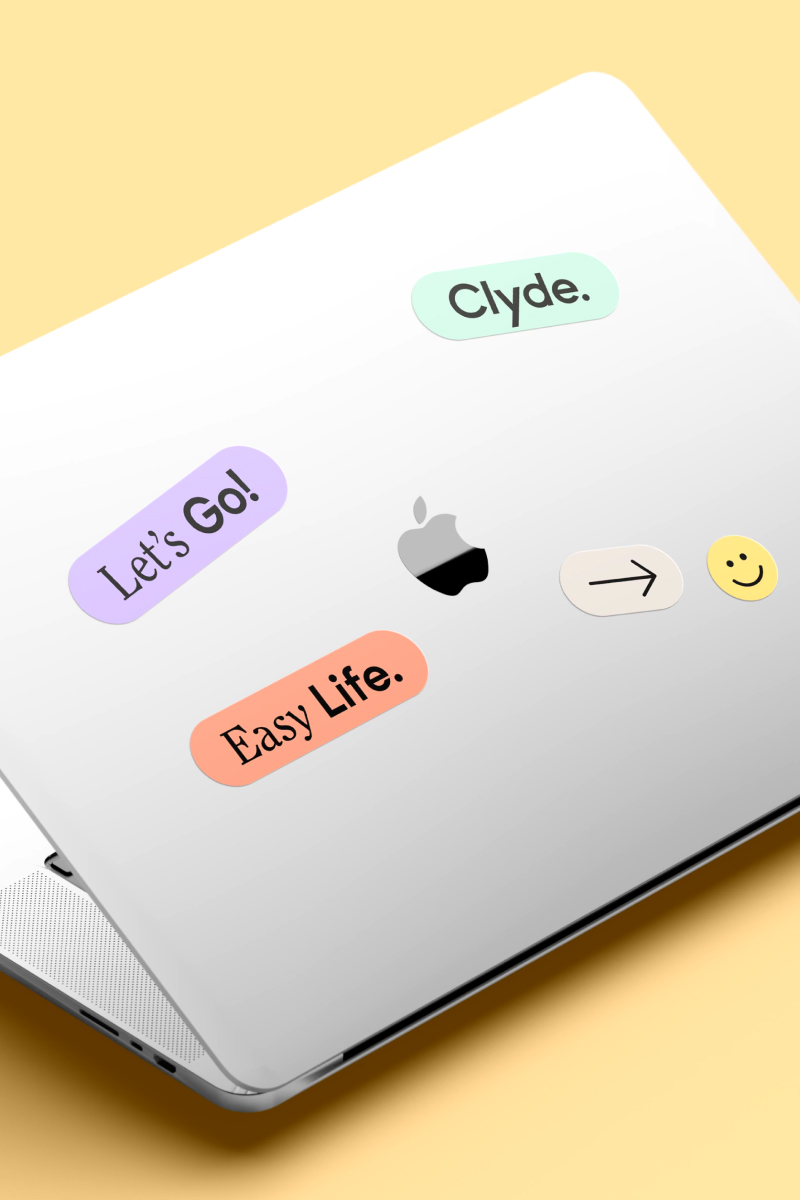
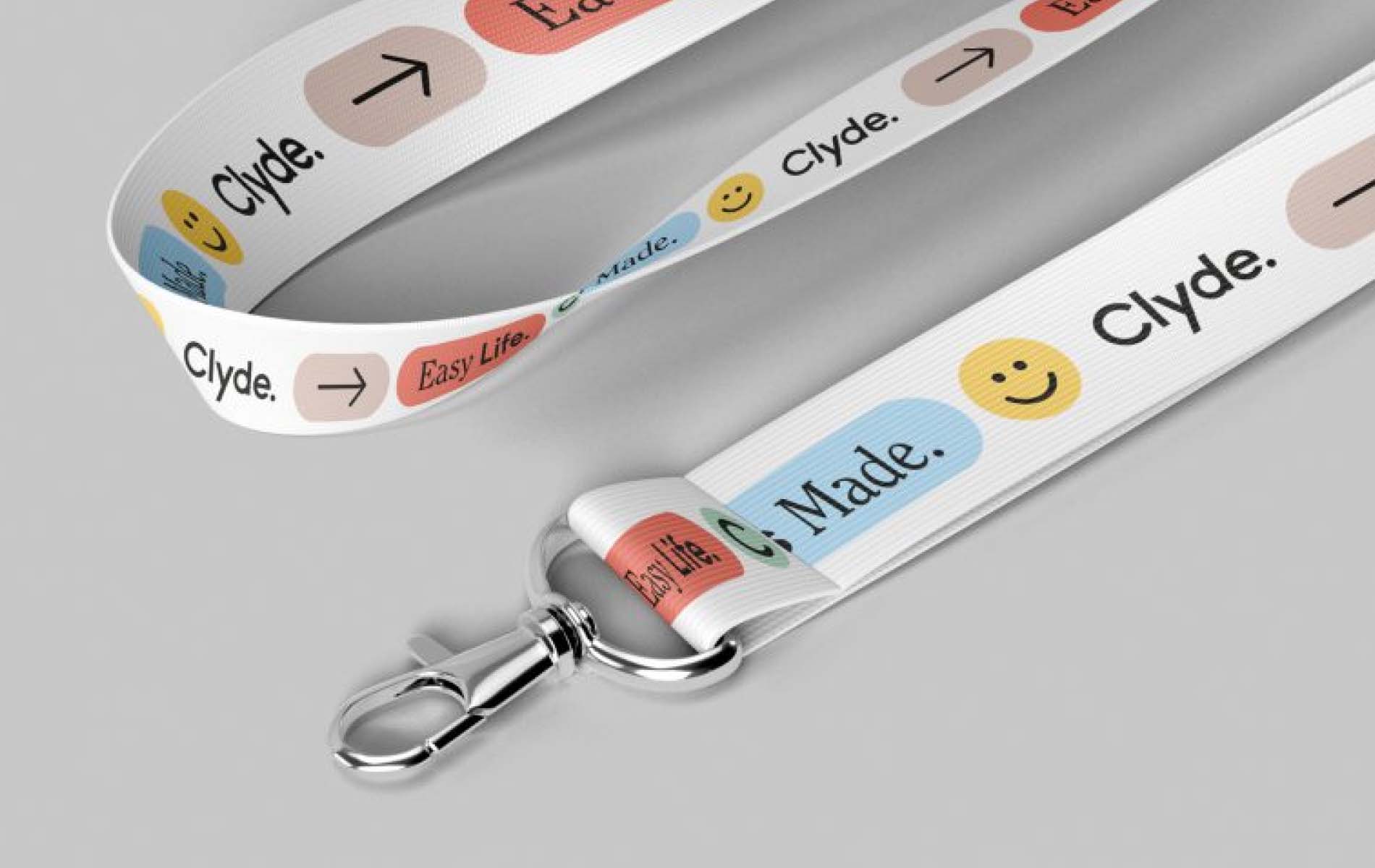
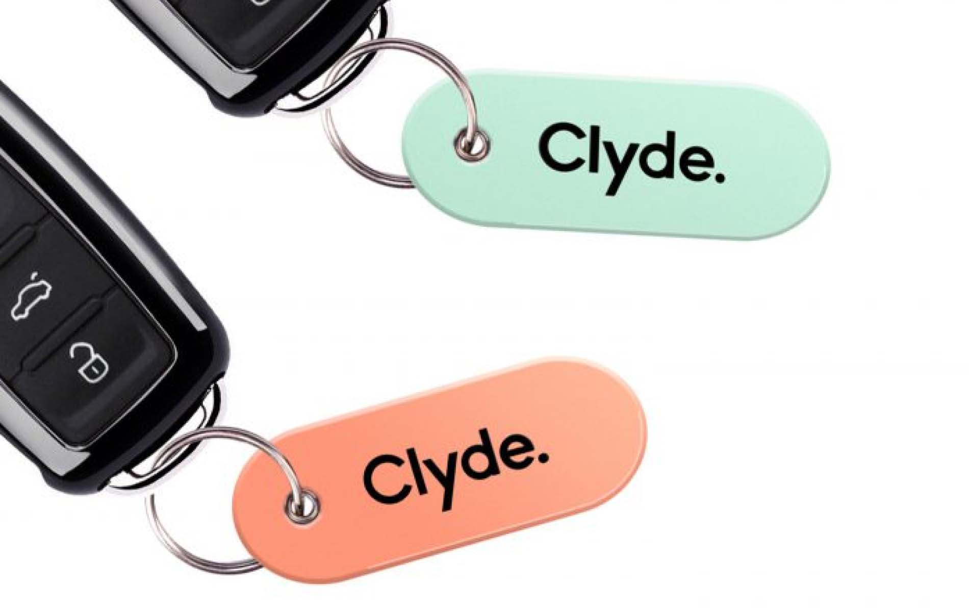
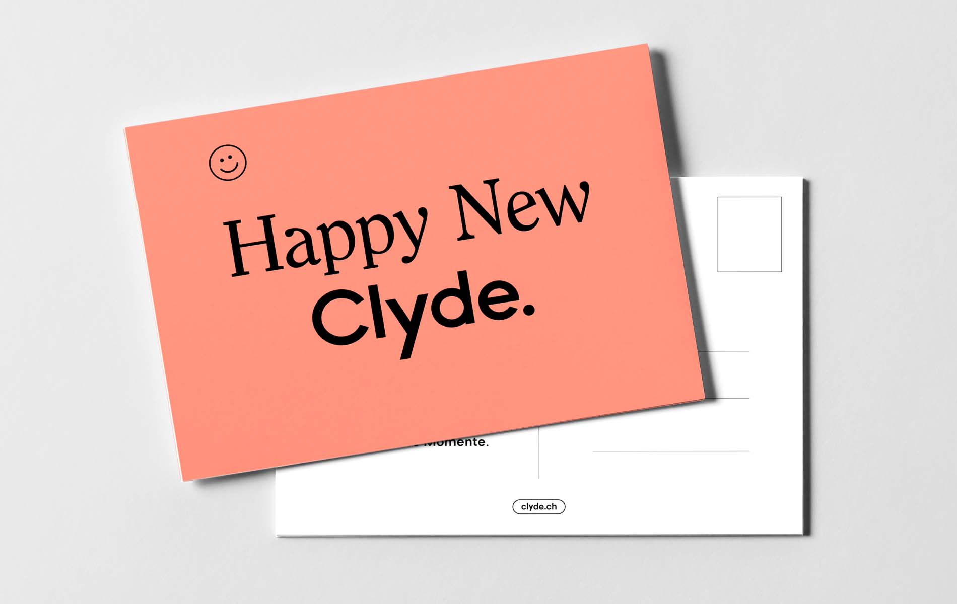
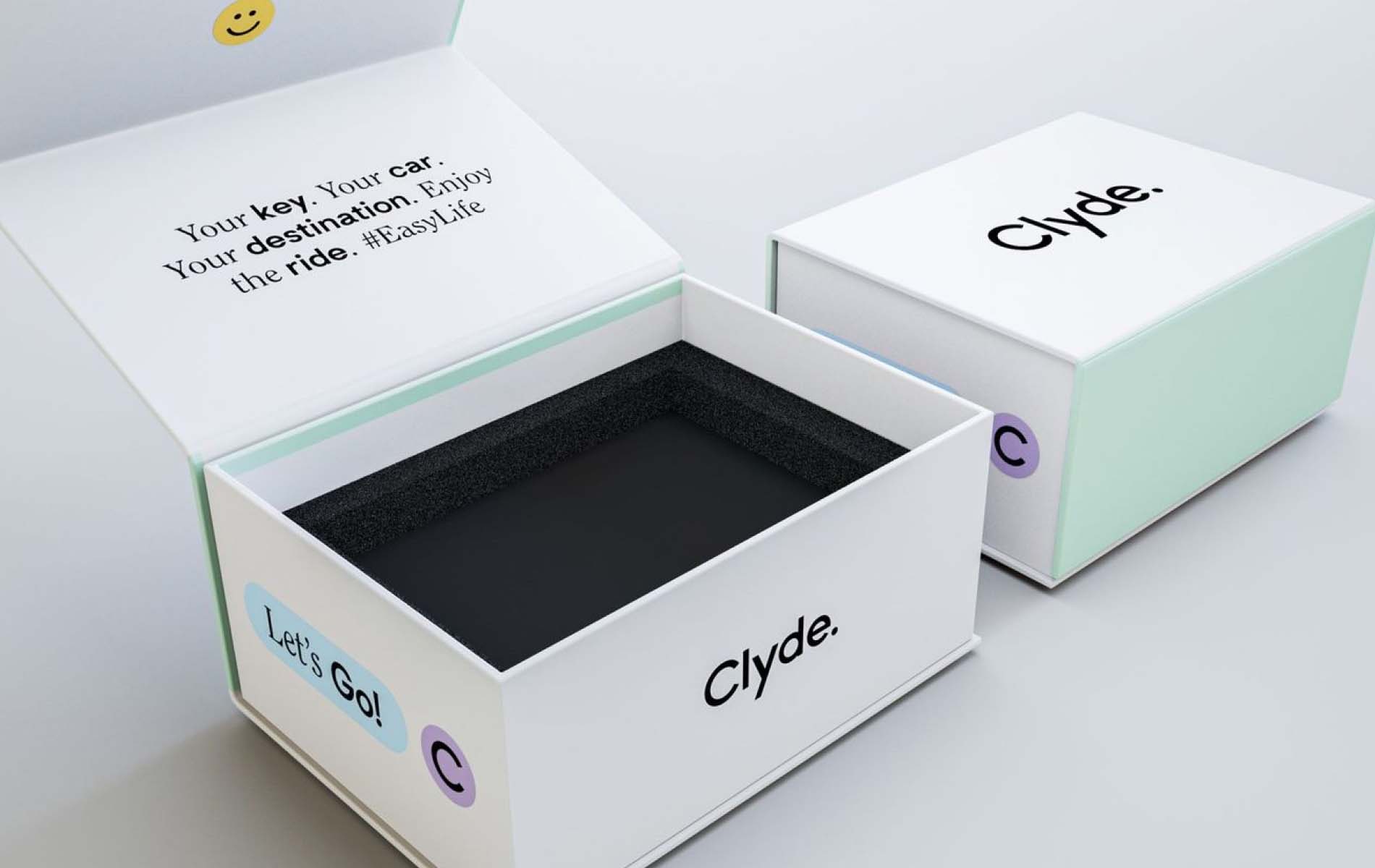
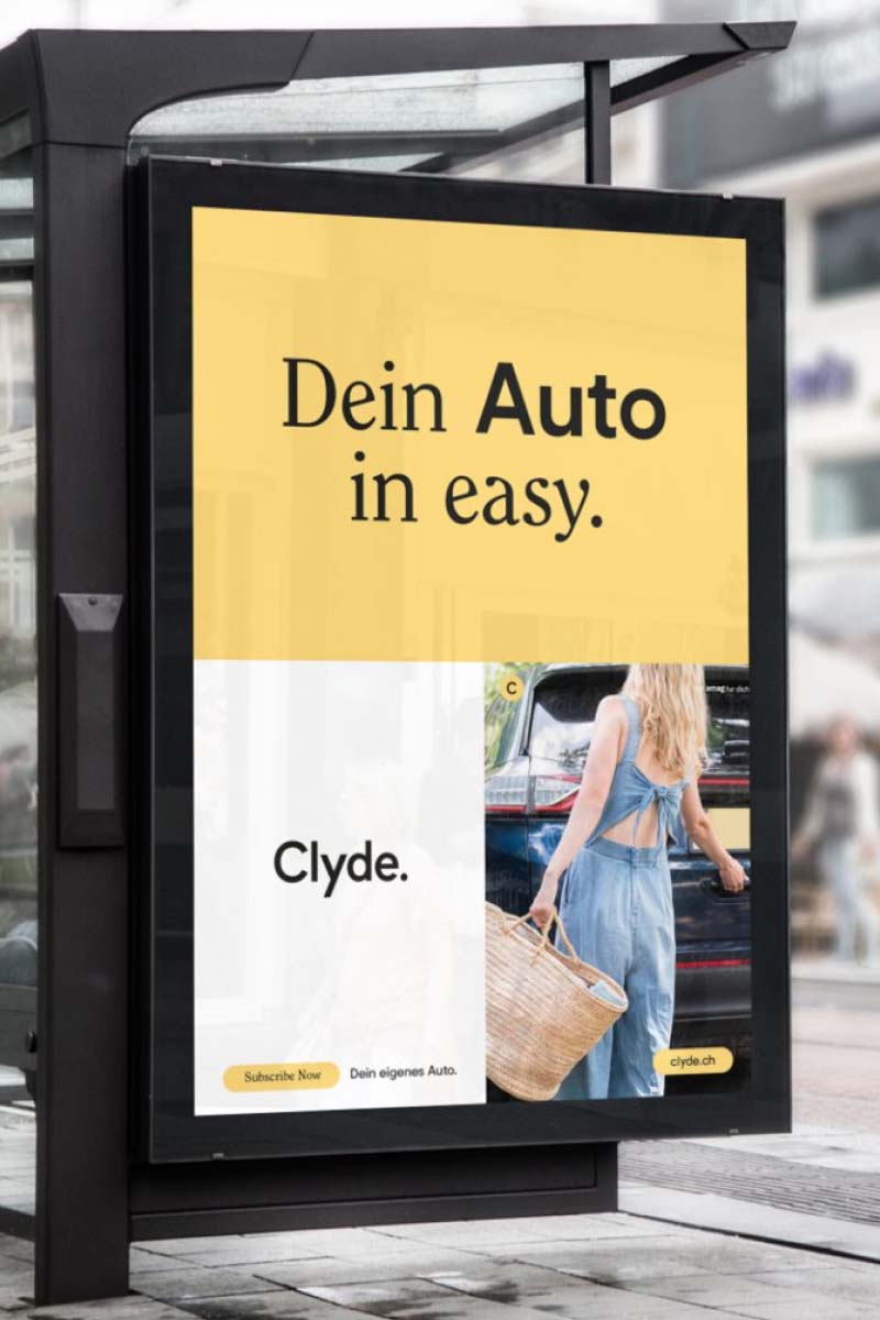
Solution: We came full circle with Clyde’s new corporate identity: the “C” became the hero, embodying a friendly, forward-moving vibe with its rounded design. An inviting color palette set a positive tone, and custom illustrations brought lightness to complex offerings and benefits. Now, Clyde is circulating across Switzerland with a bright, approachable personality, making car subscription feel as easy as hitting the road.
Client:
Clyde
Location:
Switzerland
Services:
Strategy, Branding, Marketing, Webdesign, Content
Year:





More projects


Spreading Cross-Cultural Connections

Papiseite - Modern Fatherhood, Told Digitally